Ability to view and analyse Risk (retrieved from IRM) information within Power Data widgets – Bar, Bar & Line,Donut, Gauge (speedometer) and Data Grid (scorecard & Matrix) Power Data widgets.
Basic Properties
It will allow the user to configure the Title, Left, Top, Width and Height.
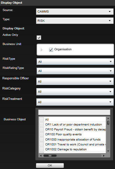
Display Objects
Following display objects are available for Risks. Once the user enters the desired settings are clicks on the ‘Save’ icon, the control will close the Edit area and load the chart.
|
Property Name |
Description |
|
|
Active Only |
Ticking this would list only the active risks in the Business Objects section. Ticked by Default. |
|
|
Business Unit |
Define business unit/s. Contains an organisation hierarchy tree, where users can traverse and select one or more business units as required. Selecting a higher level hierarchy (e.g. Directorate or Organisation) will automatically select all its lower level hierarchies. Check box 'All' is selected by default. Strategic Risks are considered as linked to the Organisation. |
|
|
Risk Type
|
Defines the Risk type; Strategic, Operational and/or Project. |
|
|
Option |
Description |
|
|
All |
Select this to display the data related to all risk types. |
|
|
Strategic |
Select 'Strategic' to display data for strategic risks. |
|
|
Operational |
Select 'Operational' to display data for operational risks. |
|
|
Project |
Select 'Project' to display data for project risks. |
|
|
Risk Rating Type |
This list box contains all the risk rating types available for the user. Multiple options can be selected. Option 'All' is selected by default. |
|
|
Risk Category |
All the risk categories setup in the system are available here for the user to choose from. Option 'All' is selected by default. |
|
|
Responsible Officer |
All active staff are listed in this list box. Required responsible officer (s) can be chosen as per user preference. Option 'All' is selected by default. |
|
|
Risk Treatment |
All the risk treatments setup in the system are available here for the user to choose from. Option 'All' is selected by default. |
|
|
Business Object |
Define risks/s. Lists out all risks within the selected business units. A search function is included for ease of selection. None of the options are selected by default. |
|
Data Filters
Following data filters are available for Risks.
|
Data Type |
Possible Filter types |
Available in |
Displayed by default in |
Description/ Notes |
|
Business Unit |
Filter (Data grid, Gauge, Donut, Chart, Matrix) |
Data grid, Gauge, Donut, Chart, Matrix |
Data grid, Gauge, Donut, Chart, Matrix (filter type: Filter)
|
N/A |
|
Risk Type |
Filter, (Data grid, Gauge, Donut) Data Column (Data grid) Series (Donut) |
Data grid, Gauge, Donut | N/A | |
|
Risk Rating Type |
Filter (Chart) X Axis (Chart) Series (Chart) |
Chart |
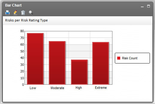
When used in Chart widget, selecting this as ‘X-axis’ will plot the chart with the relevant rating types (configured in Risk Settings > Rating Type page) as the x-axis. The chart will display the count of risks for each rating type. Selecting this as ‘Series’ will plot the chart with the rating types as the columns in the chart. |
|
| Initial Risk Rating | Filter (Data grid,, Donut) Data Column (Data grid) Series (Donut) |
Data grid, Donut | Data grid (filter type: Data Column, Filter value: Rating Type) | Initial, Revised and Future risks are available in the filters regardless of how client environment is been setup. Above risk rating types will be visible in the filters but will not affect the results if no data is available in the system. For gauge control, user can only add one rating element and Revised risk rating is selected by default. |
|
Revised Risk Rating |
Filter (Data grid, Donut) Data Column (Data grid) Series (Donut) |
Data grid, Gauge, Donut, Chart | Data grid (filter type: Data Column, Filter value: Rating Type) Gauge (filter type: Rating) Donut (filter type: Filter, Series) |
|
|
Future Risk Rating |
Filter (Data grid, Donut) Data Column (Data grid) Series (Donut) |
Data grid, Donut | ||
|
Risk Category |
Filter (Data grid, Gauge, Donut) Data Column (Data grid) Series (donut) X-Axis (Chart) |
Data grid, Gauge, Donut, Chart | Data grid (filter type: Data Column) Chart (filter type: X-axis) |
When used in Chart Widget, the risk categories will be displayed in the x-axis (the chart will display the count of risks for each category) |
|
Responsible Officer |
Filter (Data grid, Gauge, Donut, Chart) Data Column (Data grid) Series (Donut) X-Axis (Chart) |
Data grid, Gauge, Donut |
When used in chart widget, the responsible persons will be displayed as the x-axis (the chart will display the count of risks for each person) | |
|
Initial Risk Treatment |
Filter (Data grid, Gauge, Donut) Data Column (Data grid) Series (Donut) |
Data grid, Gauge, Donut |
Initial, Revised and Future risks are available in the filters regardless of how client environment is been setup. Above risk treatment types will be visible in the filters but will not affect the results if no data is available in the system. If multiple values are selected for the risk treatment, it would display in the same line, comma separated with a space. Eg: Monitor, Tolerate |
|
|
Revised Risk Treatment |
Filter (Data grid, Donut, Gauge) Data Column (Data grid) Series (Donut) |
Data grid, Gauge, Donut |
||
|
Future Risk Treatment |
Filter (Data grid, Donut, Gauge) Data Column (Data grid) Series (Donut) |
Data grid, Gauge, Donut |
||
| Risk Actions Activity Status |
Filter (Donut) Series (Donut) |
Donut | N/A | |
| Risk Assessment |
Filter (Chart) Rating (Gauge) X-Axis (Chart) Series (Matrix) |
Gauge, Chart, Matrix | Matrix (filter type: Series, Filter Value: Revised, (Dimension 1: <Likelihood or any other constituent>, Dimension 2: <Consequence or any other constituent>) |
When used in chart widget, the Initial, Revised and Future risk assessments will display in the x-axis. When used in Matrix widget, when the filter value is displayed, two additional dropdown fields will be shown: - Dimension 1 - corresponds to the rows in the matrix - Dimension 2 - corresponds to the columns in the matrix This allows the user to choose which items must be used for the two dimensions of the matrix. Both fields lists out the constituent items used for risk rating (e.g. Likelihood, Consequence) – as configured in Risk Settings > Calculations > [Tab selected in filter value]. User will not be able to select the same value in both dropdown. |
|
Risk Count |
Data Column (Chart, Matrix) | Chart, Matrix | Chart (filter type: Data Column) Matrix (filter type: Data Column, filter value: Percentage) |
N/A |
|
Last Reviewed Date |
Filter (Data grid, Gauge, Donut, Chart) Data Column (Data grid) |
Data grid, Gauge, Donut, Chart |
N/A |
Charting Control
Enable users to load and view the status of Risks within the Chart controls - Bar and Bar and Line charts. and Donut controls.
Drag and drop the charting widgets to the dashboard area.
To enable this, click the ‘Edit’ area of the control and it gives the Display Object section,select ‘Type’ as Risk in the drop down menu.
Special Note: For risks, the standard product terminology is used within this specification. However any label replacements done in IRM must reflect in Power Data
The ‘Search’ button can be used apply filters that the user added from the ‘Data’ area in the Edit section.
Bar,Bar and Line charts
Providing users the ability to view the status of Risks using Bar Charts and Bar and Line charts.
When using Chart Widget;
Clicking on a data column (or data point in a line graph) will allow you to drill down to a scorecard view of the relevant risks.
The grid will load with the default filters/indicators applicable for Risks in Data Grids. A 'Back’ button will be available to go back to the Chart view.
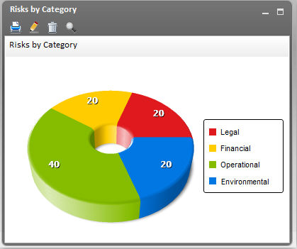
Donut Control
Enable users to load and view the status of Risks within the Donut control.
When using Donut Widget;
The donut shows the percentage of selected risks which belong to each category
Due to a limitations in the system, the figure shown on the donut will be without the ‘%’ sign.
Clicking on the slice of the donut will allow you to drill down to a scorecard view of the relevant risks. The grid will load with the default filters/indicators applicable for Risks in Data Grids view. A 'Back’ button will be available to go back to the Donut.
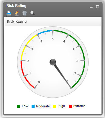
Gauge control
Enable users to load and view the performance of Risks within the Speedometer Gauge control.
When using Gauge widget;
The gauge needle indicates the average risk rating of the selected risks.
The scale of the gauge is mapped using the risk rating classification defined in Risk Settings > Calculations page
However, this differs for Initial, Revised and Future assessments. Therefore, based on the ‘Performance’ element you add in the ‘Data’ section, the appropriate scale will be plotted.
Data Grids
Enable users to load and view the performance of Risks within the scorecard & Matrix control.
When using Matrix Widget;
Similar to the standard functionality of controls in Power Data, the ‘Matrix’ control must have the following header icons initially (when the control is added to the dashboard): Print, Edit and Delete (refer Figure 32).
Each of the cells represent the risks which contains the corresponding values
The cells are colour coded, according to the colours defined in Risk Settings > Rating Type and the Legend displays beside the matrix.
Note that the colour coding is displayed only when there are two constituent criteria for the risk rating. If more than 2 criteria are used, the matrix will not be colour coded.
Clicking on a cell allows you to drill down to a scorecard view of the relevant risks.
The grid will load with the default filters/indicators applicable for Risks in Data Grids view. A 'Back’ button will be available to go back to the Matrix.
|
|
All the information will be based upon current user's system period. Rollover process may change the periodical data. In case system date is not available in the database, risk data for current period will be considered.
|
Advanced Options
Advanced options are not available for Risks.
Copyright © 2014-2015 CAMMS Online Help. All rights reserved.
Last revised: November 26, 2017
