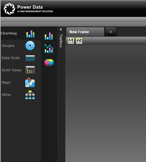
According to individual preference, many visualisation elements (widgets) can be created for display on a Dashboard.
To create a dashboard widget;
STEP 1: Click 'Toolbox' to view the available elements.

The toolbox has various visualisation options such as bar charts, gauges, grids, etc. which can be used to graphically display the data. Also the option is available to re size and rename.
STEP 2: Select a visualisation control and drag and drop it to the empty Dashboard.
The display widget has the following controls on top.
Print - Prints an image of the widget.
Edit - Opens the configuration view.
Delete - Removes the widget from the Dashboard.
filter - This is displayed when a filter is applied for the widget display object. This allows applying the filter according to the filter type.
STEP 3: Click 'Edit' to configure the widget to display the content. This opens up the configuration view.
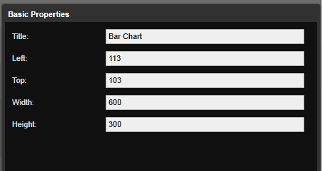
Title:name of the widget.
Left and Top: Decides the starting point
Width and Height: The mentioned measurements will be size of the widget.
|
Tab Name |
Description |
|
Basic Properties |
Configures the properties such as height, width, alignment and defines the title of the visualisation element. |
|
Display Object |
Defines a source and type for the visualisation element. The Source defines the location from where data is retrieved and Type defines the information it represents (i.e. KPI, Budget performance, Action etc.). |
|
Data |
Defines the filters. Depending on the Data Object settings, different filtering options for the content retrieval are available. User can add/edit data filtering options by selecting 'Filter Type' and 'Series Type'. |
|
Advance |
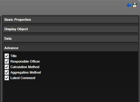
Allows displaying additional details within 'More Info' such as the Responsible Officer. |
The following configuration options are available for the visualisation controls.
STEP 4: Define the Basic Properties of the widget.
|
Property Name |
Description |
|
Title |
Title for the widget component. |
|
Left |
Left position coordinates of the widget. |
|
Top |
Top position coordinates of the widget. |
|
Width |
Width of the widget component. |
|
Height |
Height of the widget component. |
STEP 5: Open 'Display object' sliding pane. Define the source and data type properties.
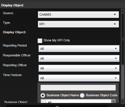
The type selected will define the type of data that is displayed within the widget. Display object fields will change depending on this selection. For instance if KPI is selected, only KPI data will be populated within the Business Object.
|
Option |
Description |
|
KPI |
Select this to display KPIs available in the system. This option is available for all dashboard widgets. |
|
Scorecard |
Select this to display scorecards available in the system. This option is only available for Data grids and Gauges. |
|
Risk |
Select to display Risks available in the system. This option is only available for Datagrids, Gauges, Donuts, Charts and Matrixes. |
|
Financial |
Select this to display financial data available in the system. This option is only available for Bar charts, Bar and line charts and Gauges. |
|
Action |
Select this to display Actions available in the system. This option is only available for Donuts, Datagrids and Gauges. |
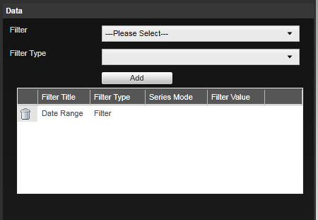
STEP 6 - Open 'Data' sliding pane and define associated filters.
|
Field Name |
Description |
|
Filter |
Lists out all possible data column/filters that can be added to the chart. |
|
Filter Type |
Select how the filter should be displayed. The drop down options would depend on the filter selected. The drop down may list the following options depending on the filter selected
|
|
Display Title |
Used to represent the selected column in the chart. You can modify the column title as required. Only visible if 'Data Column' Filter type is selected. By default would display the Filter name. |
|
Filter Value |
Displays a list of possible values for the filter selected. Value selected here would be applied as default when the chart loads. Only visible if 'Filter' Filter type is selected. |
| Series Mode |
Specify whether the data column should be a bar (default) or line. Only visible for 'Bar and Line chart' control when 'Data column' Filter type is selected. |
STEP 7 - Click 'Add' to add the filters. The table within the Data panel lists the default filters already applied to the widget.
To remove a filter, click 'Delete' alongside the filter. When the filter is removed, it is returned to the drop-down selection box.
STEP 9 - Click Save and the widget will load with the new settings.
STEP 10: Click 'Advance' to open the advanced visualisation configuration. This defines the settings of the 'More Info...' display object within the widget. Advance options available may change depending on the data type selected.
STEP 8: Once the visualisation element is configured, click the 'Save' icon to apply the changes.
 |
If the 'Series Type' is selected as 'Filter' then a search option is enabled. |
Copyright © 2014-2015 CAMMS Online Help. All rights reserved.
Last revised: November 26, 2017